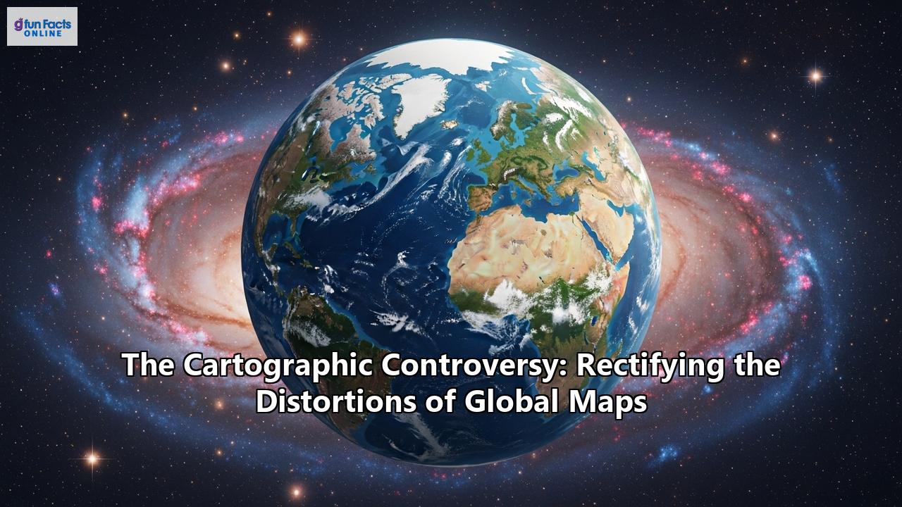
The Unseen Agenda: How Distorted World Maps Shape Our Reality
Our understanding of the world is fundamentally shaped by the maps we consult. From the classroom wall to the glowing screens of our devices, these two-dimensional representations of our spherical planet are our most common window to global geography. Yet, for centuries, the most prevalent of these windows has presented a warped and politically charged view of the world. This is the heart of the cartographic controversy: a long-standing debate over the distortions inherent in our maps and how they subconsciously mold our perceptions of power, importance, and reality itself. The lines on a map are never just lines; they are vectors of influence, and rectifying their distortions is a continuing struggle for a more accurate and equitable understanding of our shared planet.
The Sphere and the Plane: An Impossible Problem
At its core, the controversy stems from a simple, yet intractable, geometric challenge: it is impossible to represent the surface of a sphere on a flat plane without some form of distortion. Imagine trying to flatten an orange peel without tearing or stretching it—the task is futile. Every map projection, therefore, is a compromise, a set of mathematical rules that systematically distorts reality in one way to preserve a specific quality in another. Cartographers must choose what to sacrifice. The four main properties that can be distorted or preserved are shape, area, distance, and direction. Projections that preserve local shapes and angles are known as "conformal," while those that maintain the correct relative size of landmasses are called "equal-area" or "equivalent." Crucially, these two properties—conformality and equivalence—are mutually exclusive. A map cannot be both conformal and equal-area. This fundamental trade-off is the technical seed of a debate that has spanned centuries and carries profound social and political weight.
Before Mercator: Picturing a Theocentric World
To understand the revolution sparked by Gerardus Mercator, it's essential to appreciate the maps that came before. In medieval Europe, cartography was often more theological than geographical. The dominant format was the "T-O map," a conceptual representation of the world rooted in Christian cosmology. These maps depicted the known world as a circle (the "O," representing the encircling ocean) divided by a "T" formed by the Mediterranean Sea, the Nile River, and the Don River. This divided the world into the three known continents: Asia, Europe, and Africa, populated by the descendants of Noah's sons—Shem, Japheth, and Ham, respectively. Asia, often shown as large as the other two continents combined, was placed at the top, in the east (the "orient"), the direction of the rising sun and the biblical Garden of Eden. Jerusalem was typically positioned at the center, signifying its spiritual importance. These maps were not tools for navigation but visual encyclopedias of a divinely ordered world.
The rediscovery of the work of Claudius Ptolemy, a Greco-Roman scholar from the 2nd century CE, during the Renaissance marked a seismic shift. His treatise, Geographia, was translated into Latin in the 15th century, reintroducing a scientific and mathematical approach to cartography in Europe. Ptolemy pioneered the use of a grid of meridians and parallels (longitude and latitude) and developed projections to translate the curved Earth onto a plane. His work provided a framework for a more geographically recognizable world, though it still contained significant inaccuracies based on the limited knowledge of the time, such as depicting the Indian Ocean as a closed sea. The humanists of the Renaissance embraced Ptolemy's methods, and his work became the foundation upon which the next era of map-making, including Mercator's, would be built.
The Mercator Revolution: A Map for a New Age of Exploration
In 1569, the Flemish geographer and cartographer Gerardus Mercator published a large world map titled Nova et Aucta Orbis Terrae Descriptio ad Usum Navigantium Emendata—"A new and more complete representation of the terrestrial globe properly adapted for use in navigation." This was the dawn of a new era. The 16th century was the height of the Age of Discovery, and sailors desperately needed better tools to traverse the world's oceans. A significant challenge was that a course of a constant compass bearing, known as a rhumb line or loxodrome, appears as a spiral on a globe. Navigators using existing charts had to constantly adjust their course, leading to errors that could be disastrous over long voyages.
Mercator, a brilliant craftsman of globes and scientific instruments, devised a revolutionary solution. His projection was a "conformal" map, meaning it preserves local angles and shapes. To achieve this, he designed a cylindrical projection where the lines of longitude (meridians) are parallel vertical lines, and the lines of latitude (parallels) are parallel horizontal lines that are spaced further apart as they move away from the equator. This mathematical stretching had a groundbreaking effect: on a Mercator map, any rhumb line is a straight line. A sailor could now simply draw a straight line between two points and follow that single compass bearing to reach their destination.
However, this navigational utility came at a great cost: the severe distortion of area. As the parallels are stretched further apart towards the poles, the landmasses in the higher latitudes are dramatically inflated in size. On a Mercator map, Greenland appears to be roughly the same size as Africa, when in reality, Africa is about 14 times larger. Similarly, Europe appears larger than South America, and Alaska rivals Brazil in size, despite Brazil being nearly five times bigger. Mercator himself was aware of this and used other, equal-area projections for different purposes; his 1569 map was explicitly created "for the use of sailors."
The Unintended Legacy: How a Navigational Tool Forged a Biased Worldview
The Mercator projection's initial adoption was slow, but by the 18th century, it had become the standard for nautical charts. Its problems began when it was lifted from its specific navigational context and became the default projection for world maps in atlases and, crucially, on classroom walls throughout the 19th and 20th centuries.
This coincided with the peak of European colonialism. The map, with its exaggerated depiction of the northern hemisphere, became a silent but powerful tool of imperial propaganda. By visually enlarging Europe and North America, the Mercator projection reinforced a Eurocentric worldview, making the colonial powers appear larger and more significant than the colonized nations of the global south, which were disproportionately located near the equator and thus visually diminished. As critics would later argue, the map unconsciously equated size with power and importance. Maps were used to assert dominance, to claim lands on paper before they were fully occupied, and to present the imperial project as a grand, organizing enterprise. The Imperial Federation Map of 1886, for instance, used the Mercator projection to showcase the vast, interconnected British Empire, with Britain itself at the center, projecting an image of global power and control.
During the Cold War, this cartographic propaganda continued. Maps were produced that used projections and color schemes to magnify the perceived threat of the Soviet Union. By exaggerating the size of the USSR and coloring it in an aggressive red, these maps could create a sense of menace and justify political and military stances. The Mercator projection's inherent distortions played directly into this narrative, making the Soviet Union appear even more vast and imposing.
The Pushback: A Search for Cartographic Justice
The widespread and inappropriate use of the Mercator projection did not go unchallenged. As early as the 1940s, cartographers were calling for the use of new projections for general-purpose world maps. The most famous and politically charged challenge came in the 1970s from a German historian and journalist named Arno Peters.
In 1973, Peters held a press conference to denounce the Mercator projection as racist and colonialist, arguing that its distortions deliberately belittled the nations of the developing world. He presented his own map, the "Peters Projection," as a superior, "area-correct" alternative that showed all countries at their true relative size. This map, an equal-area cylindrical projection, elongated landmasses near the equator and flattened those near the poles.
Peters' impassioned critique resonated with many socially conscious groups, aid organizations, and religious institutions like the National Council of Churches, who saw the map as a tool for promoting global equality. The Gall-Peters projection, as it came to be known, became a symbol of a more just and accurate worldview.
However, Peters' campaign was fraught with its own controversies. The professional cartographic community was quick to point out that Peters had not, in fact, "invented" the projection. It was mathematically identical to a projection presented in 1855 by a Scottish clergyman named James Gall. Critics also took issue with Peters' claim that his map was superior in every way, noting that while it preserved area, it severely distorted the shapes of continents, making them appear, as one cartographer quipped, like "wet, ragged, long, winter underwear hung out to dry on the Arctic circle." Despite the professional backlash, the Gall-Peters controversy successfully brought the issue of map distortion into the public consciousness, famously even featuring in an episode of the TV show The West Wing.
A World of Alternatives: Finding a Better Balance
The debate ignited by Gall-Peters highlighted a growing desire for compromise projections that offer a more balanced and visually pleasing view of the world, even if they don't perfectly preserve any single property.
The Robinson Projection: In 1963, American cartographer Arthur H. Robinson was commissioned by Rand McNally to create a world map that "looked right." Robinson moved away from purely mathematical formulas and instead developed his projection through a more artistic and iterative process to minimize the most glaring distortions of both shape and area. The resulting Robinson projection features curved meridians and presents a more spherical appearance. For decades, it was the preferred projection of the National Geographic Society and became a common sight in classrooms and atlases, representing a significant move away from the Mercator standard. The Winkel Tripel Projection: In 1998, the National Geographic Society replaced the Robinson with the Winkel Tripel projection. Developed by German cartographer Oswald Winkel in 1921, its name "Tripel" (German for "triple") refers to its goal of minimizing three kinds of distortion: area, direction, and distance. It is a "compromise" projection that does not perfectly preserve any one property but offers one of the lowest overall distortion levels among world maps. Its curved lines of latitude and longitude give it a pleasingly spherical feel, and it has been adopted by many schools and publications as a new standard for general-purpose world maps. The AuthaGraph Projection: A more recent and radical innovation is the AuthaGraph projection, invented by Japanese architect Hajime Narukawa in 1999. This complex map is created by dividing the spherical surface into 96 triangles, transferring them to a tetrahedron, and then unfolding it into a rectangle. The result is a map that preserves the relative areas of continents and oceans with remarkable fidelity while minimizing shape distortion. It can also be tiled in any direction without seams, offering a fluid and continuous perspective of the world. The AuthaGraph won Japan's prestigious Good Design Award in 2016 and has been adopted by the Japanese government for some textbooks. In 2024, the state of Nebraska even passed a law requiring public schools to use maps based on either the Gall-Peters or the AuthaGraph projection.The Digital Dilemma: Why Old Distortions Persist Online
One might assume that in the age of interactive digital maps, the old controversies would fade away. With services like Google Maps, we can zoom seamlessly from a global view to our own street, and even switch to a 3D globe view. Yet, the default flat map used by virtually all major online providers—including Google, Bing, and OpenStreetMap—is a variant of the Mercator called the Web Mercator projection (officially EPSG:3857).
The reasons for this are primarily technical. The Web Mercator's straight, perpendicular grid of latitudes and longitudes makes the mathematical calculations for a seamless, zoomable, tiled map system much simpler and faster. When Google Maps was developed in the early 2000s, this computational efficiency was a critical factor. Furthermore, the Mercator's conformal property is advantageous at a local scale; when you zoom in on a city, shapes and angles are preserved, so buildings and streets look correct and recognizable. Since most users interact with these maps at a local or regional level, the massive distortions at the global scale were deemed a necessary trade-off for performance and local accuracy.
However, the consequence is that billions of people are still being presented with a Mercator-based, distorted view of the world as their primary geographic interface. To address this, many platforms, including Google, now switch to a 3D globe representation when zoomed out to a global scale, providing a more accurate perspective. Interactive tools like "The True Size Of..." have also gained popularity, allowing users to drag and drop countries across the map to directly compare their real sizes and visualize the extent of the Mercator distortion.
The Map in Our Mind: Psychology and the Future of Cartography
The cartographic controversy is not just about lines on paper or pixels on a screen; it's about the cognitive maps we build in our minds. Psychology and neuroscience are increasingly revealing how our brains process spatial information. Research shows that the way we perceive and remember spatial relationships is influenced by the visual representations we are exposed to. When we consistently see a map that enlarges one region and shrinks another, it can subtly embed geopolitical biases and a flawed sense of scale into our thinking. Studies in spatial cognition explore how we interpret, interact with, and store information from maps, revealing that our brains are remarkably adept at creating spatial connections, often linking memories to specific geographic locations.
The future of cartography may offer new ways to resolve the age-old problem of distortion. The rise of digital globes on our computers and phones provides a readily accessible, undistorted view of the planet, potentially rendering the debate over flat projections moot for many applications. Even more transformative is the advent of Augmented Reality (AR) mapping. AR technologies overlay digital information directly onto our view of the real world, promising a future where navigation is no longer about interpreting a 2D symbol but about following intuitive cues in our physical environment. This could fundamentally change our relationship with geographic data, moving from a representational model to an immersive one.
The journey from the theological T-O maps to the immersive landscapes of augmented reality has been a long and contested one. The cartographic controversy reveals that maps are never neutral. They are artifacts of their time, reflecting the scientific knowledge, technological capabilities, and political ideologies of their creators. The Mercator projection, a brilliant solution for a specific problem of its era, became a source of unintended and persistent distortion when its use became universal. The efforts to rectify these distortions, from Gall and Peters' politically charged campaign to the elegant compromises of Robinson and Winkel Tripel, represent a growing awareness of the power maps hold over our perception of the world. As we continue to navigate the complexities of a globalized society, the demand for maps that are not only functional but also fair and truthful remains more critical than ever. The quest for the perfect map may be impossible, but the struggle to create better, more honest ones is a vital endeavor in shaping a more accurate and equitable understanding of the world we all share.
Reference:
- https://bibliotekanauki.pl/articles/92564
- https://nwcartographic.com/blogs/essays-articles/ptolemy-s-world-map
- https://hrcak.srce.hr/file/4395
- https://user.geo.uzh.ch/sfabri/pubs/montello_etal_elgar18.pdf
- https://provenreality.com/the-future-of-augmented-reality-in-our-everyday-life/
- https://eldonthreads.com/blog/the-t-o-map-a-medieval-view-of-the-earth/
- https://www.researchgate.net/publication/302065689_Map_perception_theories_and_research_in_the_second_half_of_the_twentieth_century
- https://www.quora.com/What-is-a-T-O-map
- https://www.jetpunk.com/users/twm03/blog/a-defence-of-the-mercator-projection
- https://en.wikipedia.org/wiki/Early_world_maps
- https://commons.wikimedia.org/wiki/Category:T_and_O_map
- https://carteancienne.com/en/blogs/les-cartes-qui-ont-marque-l-histoire/ptolemy-map
- https://chnm.gmu.edu/worldhistorysources/d/344/whm.html
- https://www.icsm.gov.au/education/fundamentals-mapping/history-mapping
- https://exhibits.stanford.edu/leonardo/feature/looking-at-ptolemy-s-geography
- https://en.wikipedia.org/wiki/AuthaGraph_projection
- https://thetruesize.com/
- https://franklyspeakingnews.com/2017/09/a-defense-of-the-mercator-projection/
- https://www.maplibrary.org/1376/exploring-the-use-of-augmented-reality-in-mapping/
- https://constructionmanagement.co.uk/neuroscience-project-to-improve-digital-mapping/
- https://gis.blog.torontomu.ca/2021/02/14/maptimeru-kickoff-web-mercator-and-size-comparison-maps-with-arcgis-pro-and-qgis/
- https://www.thoughtco.com/propaganda-maps-overview-1435683
- https://storymaps.arcgis.com/stories/643158366a9e45788a8fe6c8157c63b1
- https://cartogis.org/docs/proceedings/archive/auto-carto-2/pdf/cognition-in-cartography.pdf
- https://www.trendhunter.com/trends/true-size-of-countries
- https://www.vedantu.com/geography/mercator-projection
- https://www.civilgeo.com/fr/tales-in-geography-mercators-projection-transforms-world-cartography/
- https://ccs-map.eu/311/the-future-of-interactive-maps-how-augmented-reality-is-transforming-our-perception-of-space/
- https://dev.to/anhpvbhsoft/augmented-reality-ar-and-3d-mapping-the-future-of-navigation-172b
- https://www.thegtrider.com/map-reading-some-people-better-than-others.htm
- https://en.wikipedia.org/wiki/Cartographic_propaganda
- https://www.carnegiecouncil.org/media/series/ethics-online/politics-and-cartography-the-power-of-deception-through-distortion
- https://www.researchgate.net/publication/279911278_The_Future_of_Cartography
- https://earthlymission.com/finally-a-world-map-that-gets-it-right-the-authagraph-projection/
- https://narukawa-lab.jp/archives/authagraph-map/
- https://kunimune.blog/2017/11/23/the-secrets-of-the-authagraph-revealed/
- https://www.youtube.com/watch?v=RLZlzsAiPv8
- https://www.quora.com/How-would-the-future-of-cartography-look-like-in-the-coming-10-years
- https://medium.com/@alopix/authagraph-world-map-is-pretty-cool-but-still-not-perfect-5557375c11d7
- https://www.arway.ai/augmented-reality/transforming-spaces-the-magic-of-ar-and-interactive-maps/